Sunday, 13 January 2013
WD2
WD2 Gantt Chart, Sitemap, Moodboard & FlowChart

Gantt Chart

Sitemap

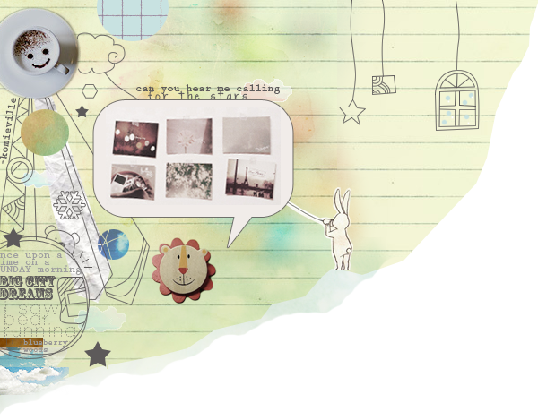
Moodboard

Flow Chart
WD2 Redesign Website Competitor Website Analysis ( Rapid Bus )

http://www.rapidpg.com.my/
• The Overall mood for the website is quite dark.
•The image of the background had already distorted and pixelated.
•The mood is not that strong yet to represent bus.
•The Information is very rich and tidy.
•The Navigation is lack of interactivity.
•Home page can be more interesting.
•The Flash animation of the buses moving around is good.
•Since it's a more interactive website, the interactivity can be more fun.
•This website use a suitable typography.

http://www.metrobustransit.ca/home.asp
•This website is totally not interesting.
•The Information on the website will get ignore by the audience.
•The Overall mood for the website is too soft and sleepy.
•The use of single color for the background is doesn't suit this website.
•Lack of interactivity.
•The advertisement banner is even more standout that the name and info.
•Too many ads in the website.
•The Typography for the website is too normal.

http://www.transnasional.com.my/
•The home page for this website is too small.
•The Information is good and organised well.
•The overall mood for the website is very dirty kind of color.
•It doesn't shows the comfortable and the beauty of the bus.
•Interactive is good.
•The gradient of the background can be something better.
•The Typography is suitable for this website.
•The information is too constrain in the rectangle box.

http://www.malaxi.com/map_transit.html
•This website is totally not interesting.
•The Information on the website is too pack together and hard to find.
•The overall mood for the website is too commercial.
•The interactivity of the website is bad.
•Use of only white color as the background makes the website looks very flat.
•The typography for the website is bad.
••It doesn't shows the comfortable and the beauty of the bus.
•The color mood doesn't represent bus.
WD2 Beautiful Website Analaysis

http://wmcmahan.com/
•The use of positive and negative space to create the website is very creative.
•The website is uses the location of yours to link with the owner.
•The overall mood for the website is very cool kind of feeling.
•The website is good in interactive.
•The use of black color as the background makes the website stands out.
•The typography for the website is suitable.
•This website shows the profesional work done by him.

http://weareanonymous.fr/
•The play of typography makes the website looks professional.
•The overall mood for this website looks very mysterious and professional.
•This website is good in interactivity.
•The designer take of every single detail in designing the interaction.
•The typography for the website is very suitable.
•The target audience is only for the big screen size user.

http://www.myprovence.fr/en
•This website attract me when i saw the color.
•This website is about scrolling and shows different info.
•The overall mood for this website looks very retro.
•This website is also very good interactivity.
•The design looks very nice and tidy.
•The use of typography for the title looks very elegant.
•Typography for the body content is also very tidy.

http://itsashapechristmas.co.uk/
•The use of the square shape and the color on the boxes attract me.
•The video in this website is doing the info-graphic style.
•The uses of shape to create illustration is very nice.
•The overall color mood suit christmas feel.
•The design is very tidy and organised.
•The use of typography for this website looks very cute.